Module 4: Finding differentially expressed genes from RNAseq data
In this exercise, we will use edgeR to call differentially-expressed genes. For the example we will use an RNAseq dataset from a treatment-vehicle design.
If you haven’t already done so, install the airway dataset:
These data are from the paper:
Himes BE, Jiang X, Wagner P, Hu R, Wang Q, Klanderman B, Whitaker RM, Duan Q, Lasky-Su J, Nikolos C, Jester W, Johnson M, Panettieri R Jr, Tantisira KG, Weiss ST, Lu Q. “RNA-Seq Transcriptome Profiling Identifies CRISPLD2 as a Glucocorticoid Responsive Gene that Modulates Cytokine Function in Airway Smooth Muscle Cells.” PLoS One. 2014 Jun 13;9(6):e99625. PMID: 24926665.
From the abstract of the original paper: “Using RNA-Seq, a high-throughput sequencing method, we characterized transcriptomic changes in four primary human ASM cell lines that were treated with dexamethasone - a potent synthetic glucocorticoid (1 micromolar for 18 hours).”
Let’s load the data
These data happen to be in a Bioconductor-specific format, so we use the special functions, assay() and colData() to get the expression data and sample information.
Questions:
- How many samples are in this experiment?
- How many genes were measured?
- How many treatment groups are there (
dexcolumn)?
Let’s created a DGEList object (DGE stands for “Differential Gene Expression”). This object is what we will use for our differential expression analysis.
Note: Make phenotype of interest categorical. In R that means converting to a factor type with categorical levels. You can think of levels as ordinal representations (e.g., first level = 1, second = 2, etc., )
If levels= are not set, the default uses alphabetical order. We recommend explicitly setting levels so that there are no assumptions.
Load the edgeR package:
Let’s create a DGEList object for the differential expression analysis. Note that group must be a categorical variable (use factor() to convert it to one):
Remove low-count genes: To filter low count genes, we’re going to use a normalized count measure called cpm (counts per million). We are going to keep genes with 100 or greater counts per million for at least two samples:
##                 SRR1039508
## ENSG00000000003        679
## ENSG00000000005          0
## ENSG00000000419        467
## ENSG00000000457        260
## ENSG00000000460         60
## ENSG00000000938          0
##                 SRR1039509
## ENSG00000000003        448
## ENSG00000000005          0
## ENSG00000000419        515
## ENSG00000000457        211
## ENSG00000000460         55
## ENSG00000000938          0
##                 SRR1039512
## ENSG00000000003        873
## ENSG00000000005          0
## ENSG00000000419        621
## ENSG00000000457        263
## ENSG00000000460         40
## ENSG00000000938          2
##                 SRR1039513
## ENSG00000000003        408
## ENSG00000000005          0
## ENSG00000000419        365
## ENSG00000000457        164
## ENSG00000000460         35
## ENSG00000000938          0
##                 SRR1039516
## ENSG00000000003       1138
## ENSG00000000005          0
## ENSG00000000419        587
## ENSG00000000457        245
## ENSG00000000460         78
## ENSG00000000938          1
##                 SRR1039517
## ENSG00000000003       1047
## ENSG00000000005          0
## ENSG00000000419        799
## ENSG00000000457        331
## ENSG00000000460         63
## ENSG00000000938          0
##                 SRR1039520
## ENSG00000000003        770
## ENSG00000000005          0
## ENSG00000000419        417
## ENSG00000000457        233
## ENSG00000000460         76
## ENSG00000000938          0
##                 SRR1039521
## ENSG00000000003        572
## ENSG00000000005          0
## ENSG00000000419        508
## ENSG00000000457        229
## ENSG00000000460         60
## ENSG00000000938          0
Look at counts per million using cpm:
##                 SRR1039508
## ENSG00000000003  32.900521
## ENSG00000000005   0.000000
## ENSG00000000419  22.628193
## ENSG00000000457  12.598138
## ENSG00000000460   2.907263
##                 SRR1039509
## ENSG00000000003  23.817776
## ENSG00000000005   0.000000
## ENSG00000000419  27.379809
## ENSG00000000457  11.217747
## ENSG00000000460   2.924057
##                 SRR1039512
## ENSG00000000003  34.439705
## ENSG00000000005   0.000000
## ENSG00000000419  24.498347
## ENSG00000000457  10.375306
## ENSG00000000460   1.577993
##                 SRR1039513
## ENSG00000000003  26.906868
## ENSG00000000005   0.000000
## ENSG00000000419  24.071095
## ENSG00000000457  10.815506
## ENSG00000000460   2.308187
##                 SRR1039516
## ENSG00000000003  46.546998
## ENSG00000000005   0.000000
## ENSG00000000419  24.009743
## ENSG00000000457  10.021102
## ENSG00000000460   3.190392
This next line is a bit complex so let’s unpack it:
- We are using
cpm(dge)>100as a logical test (“which genes have cpm > 100?”). - For each gene, we want that test to be true for at least two samples. For this we use
rowSums()to add up how many samples meet that criteria.
## [1] 63677 8# keep genes which have cpm>100 in 2 or more samples
tokeep <- rowSums(cpm(dge)>100) >= 2
# now filter for these
dge <- dge[tokeep,keep.lib.sizes = FALSE]
# how many genes do we have left?
dim(dge) #after## [1] 2086 8Normalize the data:
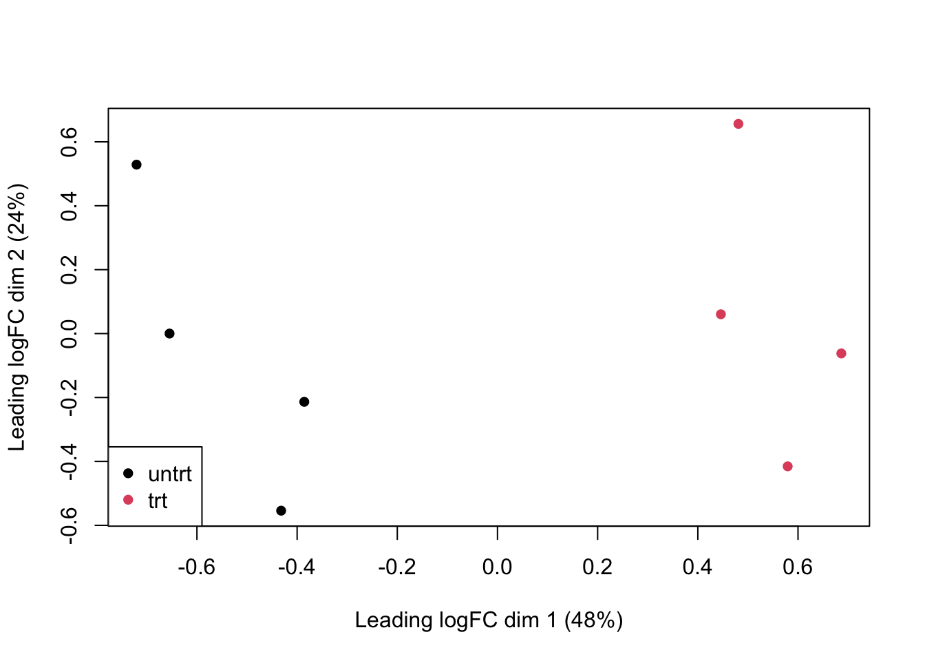
Visualize the data:
plotMDS(
    dge,
    col=as.numeric(dge$samples$group),
    pch=16
)
legend(
    "bottomleft",
    as.character(unique(dge$samples$group)),
    col=c(1,2), pch=16
    )
Let’s create a model design to identify genes with a group effect:
Estimate variation (“dispersion”) for each gene:
Call differentially expressed genes.
Here we:
- fit a model for each gene, using
glmFit - we have built in an estimate of gene-wise dispersion to better identify treatment effect (or “contrast”)
- for each gene, we run a likelihood ratio test which compares which model fits the data better: a null model (treatment effect = 0) or a full model (treatment effect is non-zero)
Note that coef=2 fetches the effects for the treatment effect; coef=1 would fetch effects of the intercept term.

Look at the top 10 differentially expressed genes:
## Coefficient:  groupuntrt
##                     logFC
## ENSG00000152583 -4.512108
## ENSG00000178695  2.592010
## ENSG00000120129 -2.857535
## ENSG00000189221 -3.213455
## ENSG00000125148 -2.110664
## ENSG00000162614 -1.938280
## ENSG00000101347 -3.764745
## ENSG00000096060 -3.849662
## ENSG00000134686 -1.294763
## ENSG00000166741 -2.072008
##                   logCPM
## ENSG00000152583 5.950547
## ENSG00000178695 7.433587
## ENSG00000120129 7.727638
## ENSG00000189221 7.183776
## ENSG00000125148 7.835949
## ENSG00000162614 8.397283
## ENSG00000101347 9.620058
## ENSG00000096060 7.313033
## ENSG00000134686 7.426574
## ENSG00000166741 8.859215
##                       LR
## ENSG00000152583 190.5712
## ENSG00000178695 171.7187
## ENSG00000120129 167.2022
## ENSG00000189221 162.3746
## ENSG00000125148 156.1280
## ENSG00000162614 135.2052
## ENSG00000101347 128.9686
## ENSG00000096060 123.8841
## ENSG00000134686 121.0663
## ENSG00000166741 114.0478
##                       PValue
## ENSG00000152583 2.385925e-43
## ENSG00000178695 3.117449e-39
## ENSG00000120129 3.021823e-38
## ENSG00000189221 3.426477e-37
## ENSG00000125148 7.937896e-36
## ENSG00000162614 2.977497e-31
## ENSG00000101347 6.889897e-30
## ENSG00000096060 8.930961e-29
## ENSG00000134686 3.695702e-28
## ENSG00000166741 1.272045e-26
##                          FDR
## ENSG00000152583 4.977039e-40
## ENSG00000178695 3.251499e-36
## ENSG00000120129 2.101174e-35
## ENSG00000189221 1.786908e-34
## ENSG00000125148 3.311690e-33
## ENSG00000162614 1.035176e-28
## ENSG00000101347 2.053189e-27
## ENSG00000096060 2.328748e-26
## ENSG00000134686 8.565816e-26
## ENSG00000166741 2.653486e-24
For the next steps we’re going to need stats on all the genes we’ve tested. So let’s get those:
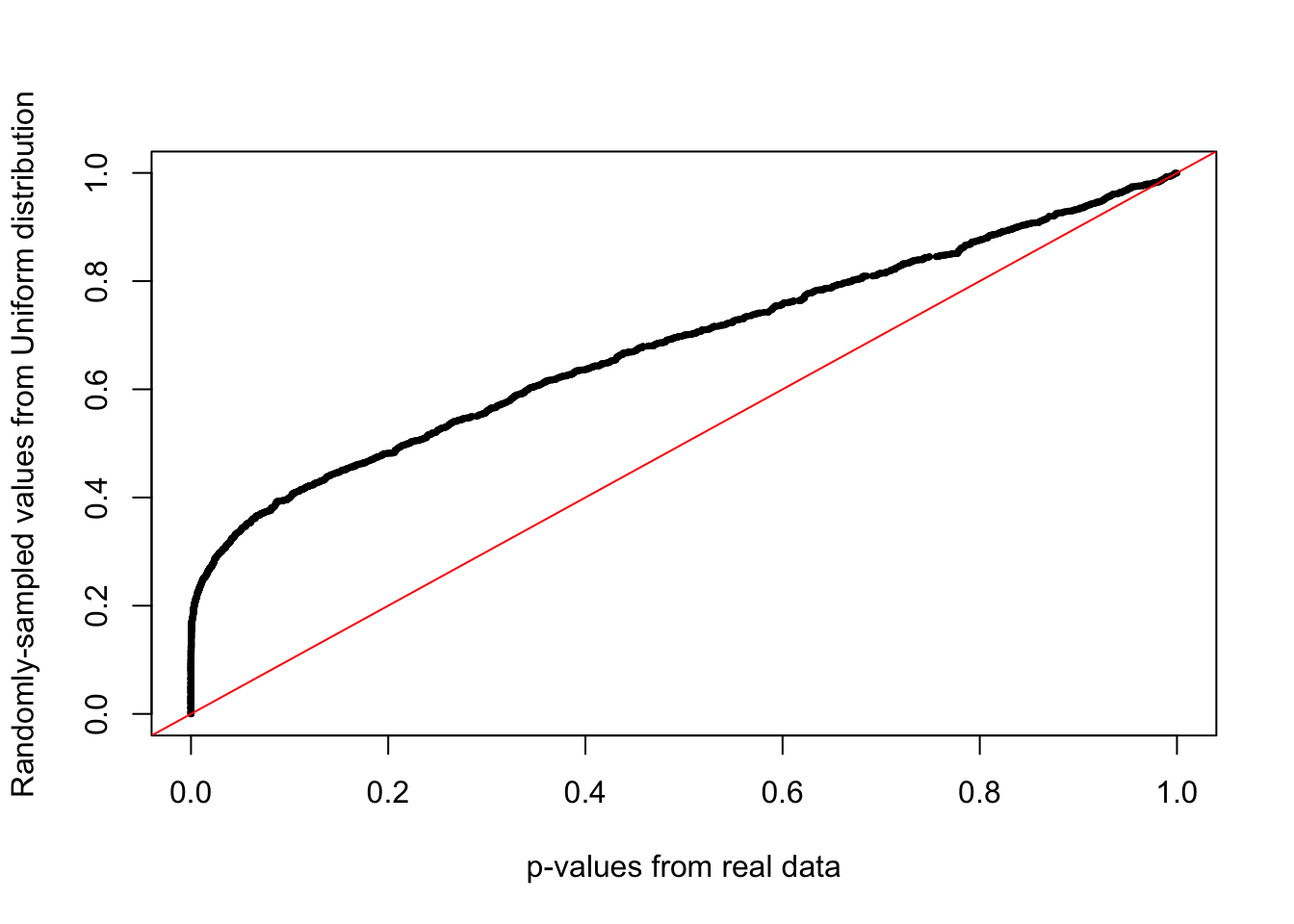
A QQplot directly compares the pvalues from our statistical tests to the expected values from a random uniform distribution (p-value selected at random).
A deviation from the x=y line (diagonal) towards the top indicates an enrichment of signal.
qqplot(
    tt$PValue,
    runif(nrow(tt)), # randomly sample from uniform distribution
    xlab="p-values from real data",
    ylab="Randomly-sampled values from Uniform distribution",
    pch=16,cex=0.5
)

# x=y line as reference
abline(0,1,col="red")
Now let’s call differentially expressed genes using the decideTestDGE() function and use summary() to see how many genes are upregulated (value +1), downregulated (value -1) and not called as changed (value 0)
##        groupuntrt
## Down          317
## NotSig       1553
## Up            216
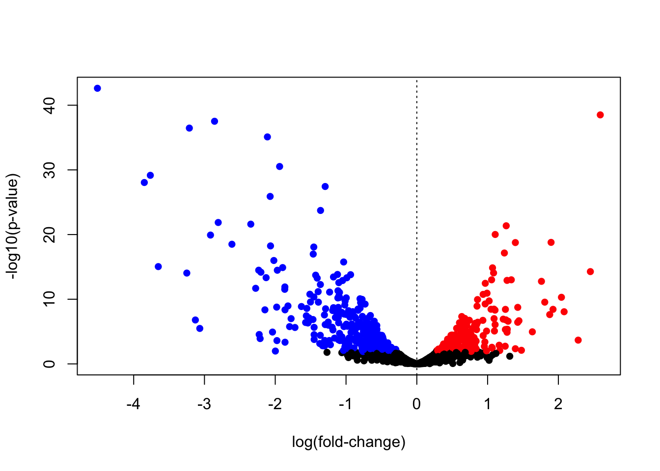
Volcano plot (R base graphics)
A volcano plot can help visualize effect magnitude - log2 fold-change or log2FC in the table ` against the corresponding p-value. Here we create a volcano plot, and colour-code upregulated genes in red, and downregulated genes in blue.
Let’s merge the data from tt and diffEx2 (which has the up-/down-regulated status):
# needed to use merge function
diffEx2 <- as.data.frame(diffEx2)
# give column more intuitive name
colnames(diffEx2)[1] <- "gene_status"

# add the common "gene" column to merge the two tables
diffEx2$gene <- rownames(diffEx2)
tt$gene <- rownames(tt)

mega <- merge(x = tt, y = diffEx2, by="gene")
Now we create a vector of colours, so that our upregulated genes are in red, downregulated genes are in blue, and not-significant genes are in black:
cols <- rep("black",nrow(tt))
cols[which(mega$gene_status > 0)] <- "red" # upregulated
cols[which(mega$gene_status < 0)] <- "blue" # downregulated
mega$cols <- cols

# volcano plot
plot(mega$logFC,
    -log10(mega$PValue),
    pch=16,
    col=mega$cols,
    xlab="log(fold-change)",
    ylab="-log10(p-value)"
)
abline(v=0,lty=3)
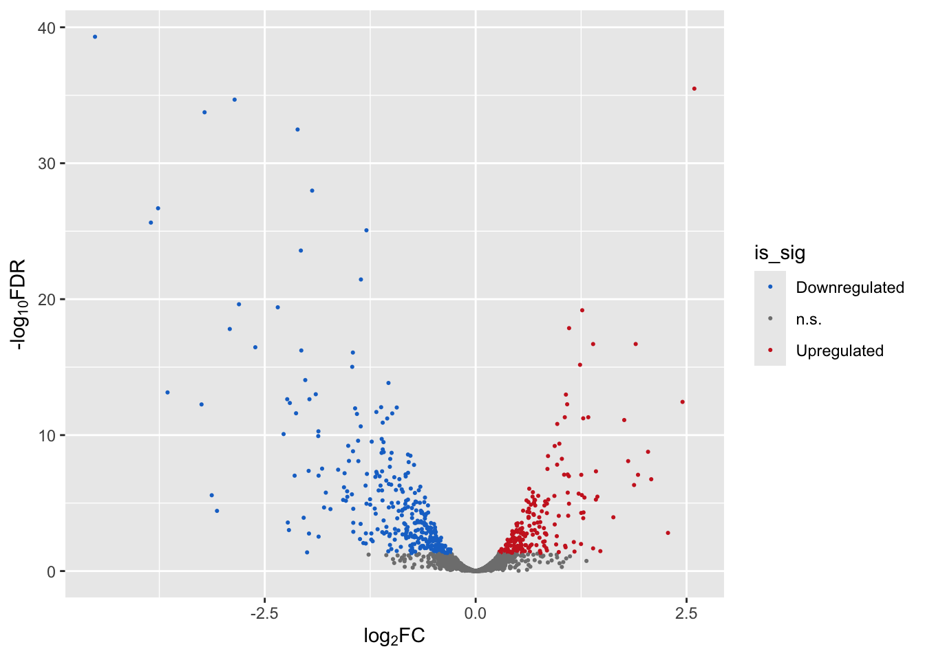
Volcano plot (ggplot2)
Let’s create a volcano plot using the ggplot2 library.
For this let’s add a NEW column indicating whether a gene is up-regulated, down-regulated, or n.s.
is_sig <- rep("n.s.", nrow(mega)) # default is ns
is_sig[which(mega$gene_status > 0)] <- "Upregulated"
is_sig[which(mega$gene_status < 0)] <- "Downregulated"

# use levels() to tell R how to order the categorical
# variables. Downregulated = 1, n.s.=2, and Upregulated=3.
# By default, R orders categorical variables alphabetically,
# which may not make sense!
mega$is_sig <- factor(is_sig,
    levels = c("Downregulated","n.s.","Upregulated"))
Now let’s create a volcano plot, colouring the dots by significance status.
We will use scale_color_manual() from the ggplot2 package to add a custom colour scheme.
p1 <- ggplot(mega,
    aes(x = logFC, y = -log10(FDR))) + # -log10 conversion
    geom_point(aes(color=is_sig),size = 2/5) +
    xlab(expression("log"[2]*"FC")) +
    ylab(expression("-log"[10]*"FDR")) +
    scale_color_manual(
        values = c("dodgerblue3", "gray50", "firebrick3"))

p1
Finally we can write our differential expression results out to file:
Bonus Exercise
- Install the
yeastRNASeqpackage from Bioconductor andlibraryit into your environment - Import the geneLevelData using:
data("geneLevelData") - Learn about this data and then put it through the same workflow we just did for the breast cancer:
- Create a new
DGEListobject with your gene counts - Filter genes with CPM > 25 in at least two samples
- Normalize and plot your data
- Create a model matrix for analysis
- Fit your model
- How many significantly up-regulated genes are there at the 5% FDR level? How many significantly down-regulated genes? How many in total
- Create a volcano plot
- Bonus: Create a histogram of p-values. Is there a signal?
Is there anything about the data that might make you question the results?