Interface
Three resizable panels, one selection.
The application is a single screen. There is no navigation, because a patient who has to navigate has already lost the thread of their own question.
The layout
The header and footer are fixed. Everything between them is a resizable panel group: chat on the left, and on the right a second group split vertically into the map and the trial summary. Dragging any divider re-lays out the panels.
The three panels share one selection, held in a zustand store. None of them talk to each other: each reads that store and writes back to it.
Chat panel
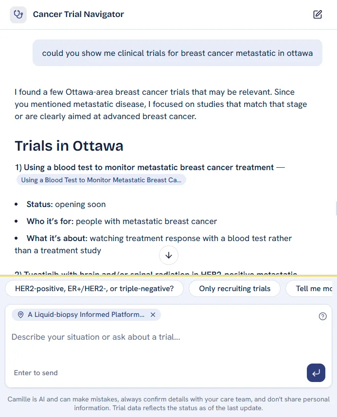
The chat is where the whole conversation happens, and it is the only panel the patient types into. Four things are worth naming.
- Inline citations. A trial referenced in the answer renders as a card. Hovering shows the trial's title, and clicking it flies the map to that trial's sites.
- Term definitions. Medical vocabulary is marked in the text, and hovering opens a plain-language definition.
- Ask AI on a selection. Highlighting any text in the panel raises an Ask AI popover, so a follow-up question can be asked about the exact phrase that was unclear.
- Per-turn feedback. Every answer carries a thumbs control, and a rating can be sent with a comment.
Map panel
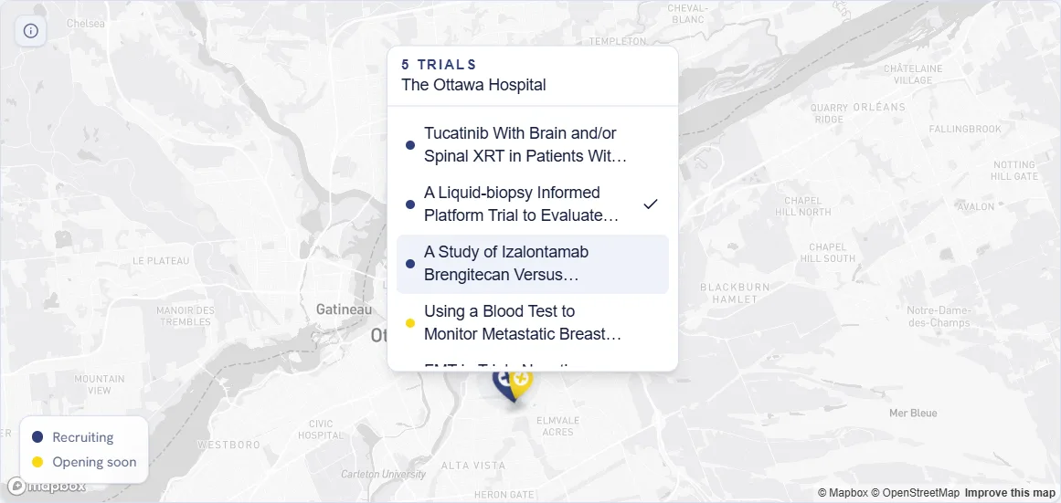
The map holds the sites of the trials in the current answer. Pins are grouped per coordinate, because a single hospital may host many studies and a stack of overlapping teardrops is unreadable.
- Count pins. Every pin shows how many trials sit at that coordinate.
- Dual pins. When trials at one address have different recruiting statuses, one tip carries two balloons, each with its own status colour and count.
- Clusters. Co-located trials open a popup list anchored to the pin.
Summary panel
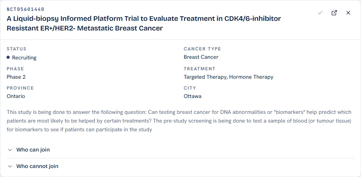
The summary is the full record of one selected trial, whichever panel selected it. It carries the title, the facts (status, phase, cancer types, sponsor), the eligibility criteria as written, and the list of sites. Long titles clamp with a control to show the rest.
Gates before the app
A first-time visitor passes two gates, in a deliberate order.
Consent comes first
Consent sits outside first. The dialog withholds the entire application until the checkbox is ticked, and it re-prompts everyone when the terms version changes.
The bot check
Turnstile is verified once per browser, against a persistent verification ID to protect the site from automated traffic.
Outside production the bot gate is off entirely.
Design system
The interface has one visual identity, defined as CSS custom properties and exposed as Tailwind utilities. This documentation site uses the same tokens, which is why the two look like one product.
Colour
Type
Three typefaces, each with one job.
| Face | Used for |
|---|---|
| Bricolage Grotesque | Display and headings |
| Hanken Grotesk | Body text and interface |
| JetBrains Mono | Numbers and identifiers |
The scale is a fixed set of classes (.text-display, .text-headline, .text-title,
.text-subhead, .text-eyebrow, .text-caption).
Last updated on